
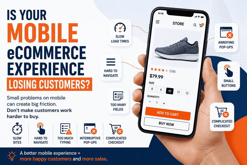

Is Your Mobile eCommerce Experience Losing Customers?
Your website may work perfectly on desktop and still create friction for mobile customers. Here's what to investigate before assuming you need a redesign.
Your website works.
Your products are available.
Your checkout works.
Your desktop experience looks good.
So why aren't more mobile visitors buying?
A mobile website can technically work and still create a poor customer experience.
You may be looking at your store from a desktop computer and thinking:
"Everything seems fine."
But your customer may be using a phone.
They may be searching for a product with one hand. They may be on a slower connection. They may be trying to compare products quickly.
And small points of friction can be enough to make them leave.
Does your mobile experience make it easy for customers to buy?
Your Mobile Experience May Be Very Different From Your Desktop Experience
When you open your website on a large screen, you have plenty of space.
Navigation is visible. Product information fits comfortably. Images are easy to see. Forms are easier to complete.
Now open the same website on a phone.
Nothing may actually be "broken."
But the effort required from the customer has increased.
Is Your Mobile Navigation Making Customers Work Too Hard?
Imagine a customer arrives at your store knowing roughly what they want.
They need:
Running shoes
On desktop, they may immediately see:
On mobile, they may have to:
That's a lot of interaction before they even see a product.
"This is taking too long."
That's what the customer may be thinking.
Ask yourself: Can a new visitor find your main product categories quickly on a phone?
Is Mobile Search Actually Useful?
Many mobile customers don't want to browse through multiple categories.
They already know approximately what they're looking for.
Problems can appear when:
- Search is difficult to find
- Search suggestions aren't useful
- Products aren't indexed properly
- Search results are irrelevant
- Filters don't work well
- The customer has to type too much
- Search results aren't easy to scan
The customer may have arrived with strong purchase intent. Don't make them work to find what they're looking for.
Are Your Product Pages Easy to Use on Mobile?
A product page can look excellent on desktop and become frustrating on a phone.
Think about what the customer needs to understand before buying:
- What does the product look like?
- What does it cost?
- What sizes or variants are available?
- Is it in stock?
- When will it arrive?
- Can I return it?
- What do other customers say?
- What makes this product different?
- How do I buy it?
On mobile, everything becomes a vertical journey.
Are the most important buying decisions easy to make on a small screen?
Can Customers Easily Tap the Important Buttons?
Mobile interaction is different from desktop interaction.
A mouse pointer can be very precise. A finger can't.
Think about:
- Add to Cart
- Buy Now
- Search
- Filters
- Product variants
- Quantity controls
- Continue to Checkout
- Payment buttons
If buttons are too small or too close together, the customer has to be more careful.
If you're trying to make a purchase, unnecessary effort is friction.
If I were using this website with one hand, could I comfortably complete the purchase?
Is Your Mobile Website Too Slow?
This is one of the most important areas to investigate.
But don't reduce the problem to:
"What's our PageSpeed score?"
A score can be useful.
But customers don't experience a score.
Customers Experience:
Imagine a customer clicks a product.
They wait.
They scroll.
They try to select a variant.
The interface moves.
They tap Add to Cart.
Nothing seems to happen immediately.
That's not just a technical problem. It's a customer experience problem.
Are Pop-Ups Interrupting the Mobile Experience?
Pop-ups can be useful.
A discount can encourage a first purchase. An email signup can build your customer database. A promotion can increase engagement.
But mobile screens are small.
The business may have added each tool for a good reason.
But from the customer's perspective:
"I just want to see the product."
The question isn't whether you should remove all pop-ups.
It's whether they're helping the customer or interrupting the buying journey.
Can Customers Compare Products Easily?
Mobile customers often need to make decisions quickly.
They may compare:
- Price
- Features
- Size
- Reviews
- Specifications
- Availability
If your mobile experience makes comparison difficult, customers may leave and start searching elsewhere.
Your mobile experience should help answer: "Which product is right for me?"
Are Your Filters Actually Usable on Mobile?
Filters can be extremely useful for large eCommerce catalogs.
But poor mobile filters can become frustrating.
Example
If every filter requires several taps, scrolling, opening and closing menus, the process becomes tiring.
Can customers quickly narrow hundreds or thousands of products down to the ones that matter to them?
Is Your Mobile Checkout Creating Friction?
The customer has already done the hard part.
They found a product. They decided to buy. They added it to the cart.
Now they're asked to complete the purchase.
Look at:
- Address fields
- Form length
- Autofill
- Payment methods
- Shipping selection
- Error messages
- Coupon fields
- Account creation
- Order review
- Payment confirmation
How much effort does it take to complete an order on a phone?
Not:
"Does the checkout technically work?"
Those are two very different questions.
Are You Making Customers Type Too Much?
Typing on a desktop is relatively easy.
Typing on a phone is more demanding.
Some of these may be necessary.
Some may not be.
If we don't actually need this information to complete the transaction, why are we asking for it?
Are You Testing the Experience Like a Customer?
This is one of the simplest things you can do.
Take your phone.
Don't open your website as the business owner.
Pretend you've never seen the store before.
Then try to complete a purchase.
Test the Complete Journey
Don't just ask:
"Does everything work?"
Ask:
"Where did I feel friction?"
Your Mobile Conversion Rate Can Tell You Something Important
One of the first things I'd compare is desktop conversion versus mobile conversion.
| Device | Conversion Rate |
|---|---|
| Desktop | 2.8% |
| Mobile | 0.9% |
That doesn't automatically mean mobile UX is the problem.
There could be other explanations.
But a large difference is a signal worth investigating.
Investigate the Difference
Don't Assume Mobile Is the Problem
If mobile conversion is lower, don't immediately conclude:
"We need a mobile redesign."
The problem could be:
Traffic quality · Product mix · Pricing · Shipping · Customer intent · Product information · Performance · Checkout · Payment issues · Technical errors
That's why we need diagnosis before deciding what to change.
Look for the Bottleneck
Think about the mobile buying journey.
Where is the biggest drop?
If visitors don't reach product pages, the problem may be navigation or traffic quality.
If they view products but don't add to cart, investigate the product experience.
If they add to cart but don't start checkout, investigate the cart experience.
If they start checkout but don't purchase, investigate checkout.
This is much more useful than simply saying: "Mobile needs improvement."
Don't Redesign Your Mobile Website Just Because It Looks Old
This is a trap many businesses fall into.
Someone opens the website and says:
"It looks outdated."
So the business decides to redesign everything.
Six months later:
- New design
- New development cost
- New bugs
- New integrations to maintain
- Possibly no meaningful improvement in conversion
A Better Approach
That's how you avoid turning a business problem into an expensive redesign project.
What Should You Check First?
If you're concerned that your mobile experience is losing customers, start here.
Your Mobile Website Is Part of Your Sales Experience
It's easy to think about mobile as a technical requirement.
"The website is responsive."
"The buttons work."
"The checkout works."
But customers don't experience your website as a technical checklist.
They experience it as a journey.
The Bigger Question Isn't "Is My Website Mobile-Friendly?"
That's actually a fairly low bar.
Almost every modern eCommerce business can say:
"Yes, our website is mobile-friendly."
The better question is:
Is our mobile experience helping customers move toward a purchase?
Because there's a big difference between:
Final Takeaway
Your mobile website isn't simply a smaller version of your desktop website.
For many eCommerce businesses, it is one of the primary ways customers experience the brand.
If customers are struggling to find products, understand products, compare options, add products to cart or complete checkout, you may be losing customers long before you realize there's a problem.
Don't immediately assume you need a redesign.
First understand:
Where are mobile customers leaving?
What are they experiencing?
How is mobile behavior different from desktop?
What does the data tell you?
And most importantly:
What should you fix first?
Is Mobile Only One Part of the Problem?
Your mobile experience may be contributing to lost sales.
But it may be only one part of a larger eCommerce conversion problem.
You could also be losing customers because of poor traffic quality, product discovery problems, product-page friction, slow performance, cart abandonment, checkout problems or technology issues.
The important question isn't simply:
What can we improve?
It's:
What deserves attention first?
Explore the Bigger Problem